C-Hub
C-Hub is an EdTech ecosystem, a platform that helps youth and professionals find their career path or improve their career journey.
visit site: chubworld.com
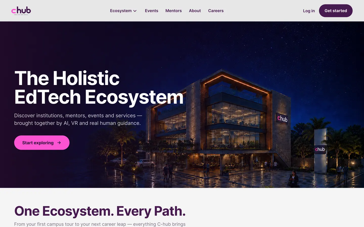
Their website was a fully functioning web application, but the design and user flow were very confusing for users. It created a very high cognitive load. So I was told to redesign the web application. I redesigned the web and handed it over to the development team.

Previously, the website had ten links in the header and no clear CTA. Also, five of the links repeated the word C-Hub. For example: C-Hub AI-Store, C-Hub Schools, C-Hub Campus... This could make users confused.
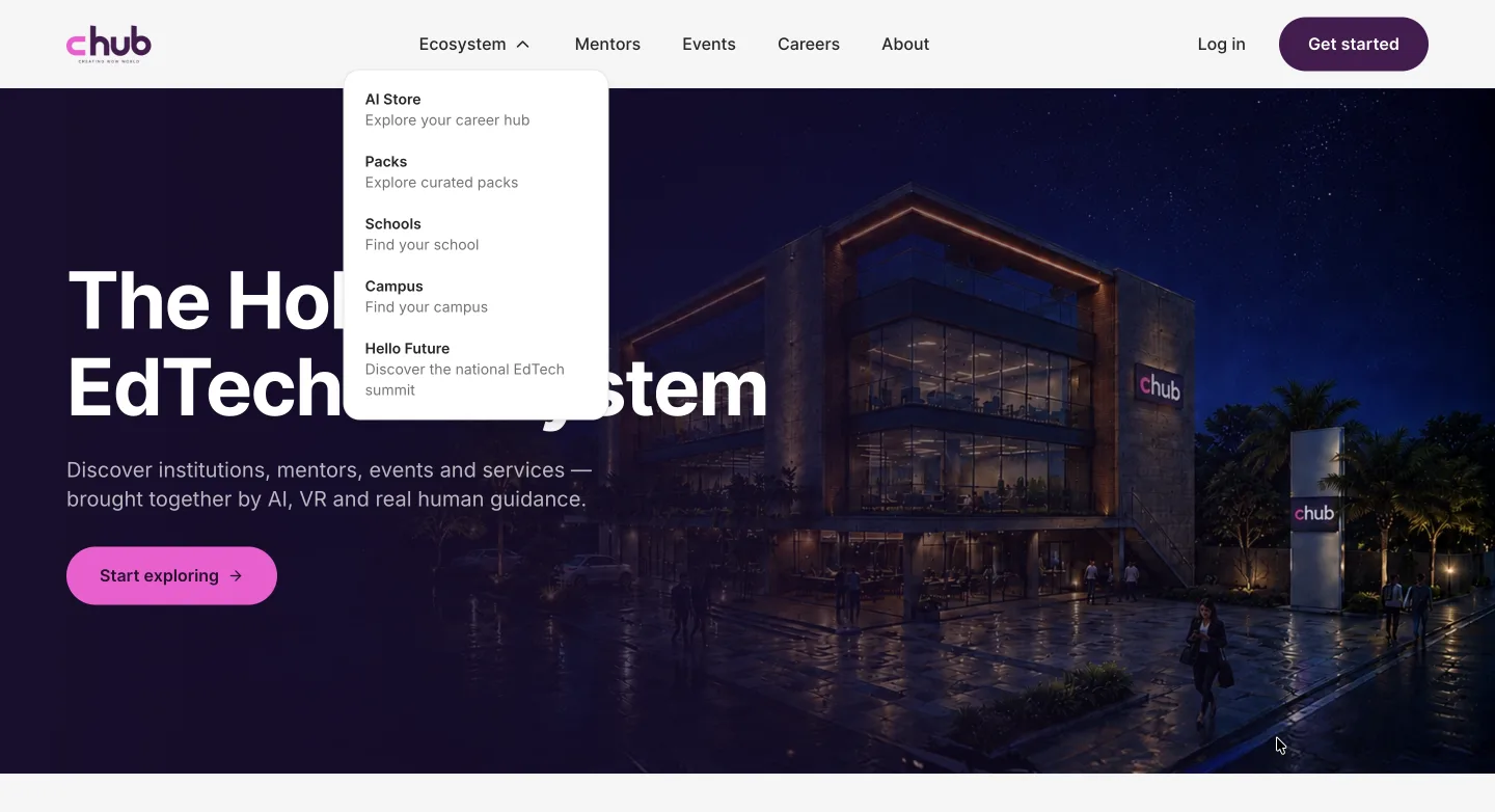
I restructured the header. I placed all the services that C-Hub provides under their ecosystem into a dropdown called "Ecosystem" and made two clear CTAs for Login and Sign Up.


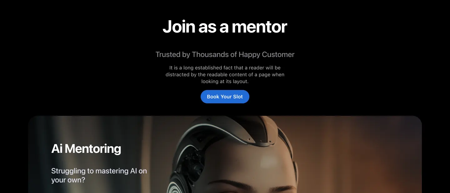
Previously, when a user landed on the website and scrolled, the first section asked them to find a mentor. In the next section, if they continued scrolling, it asked them to join as a mentor. This flow could create confusion for users.
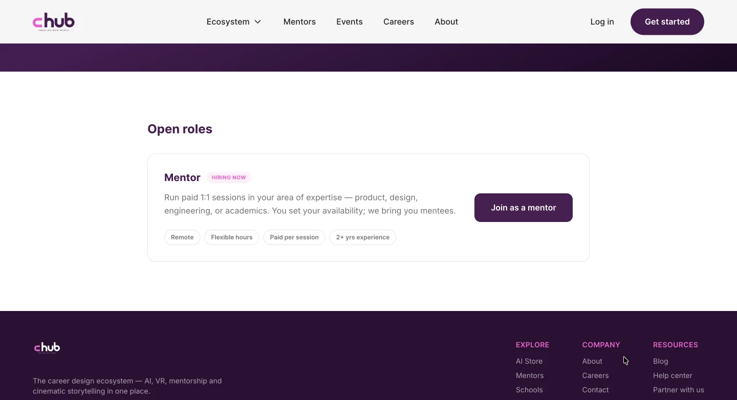
So I changed the flow and moved the "Join as a Mentor" option to the Careers page, which can be accessed from the header.
Why I did it this way: joining as a mentor is a career opportunity at C-Hub, and a person who wants to find career opportunities usually expects to find them under the Careers link in the header because this is a common pattern across websites.
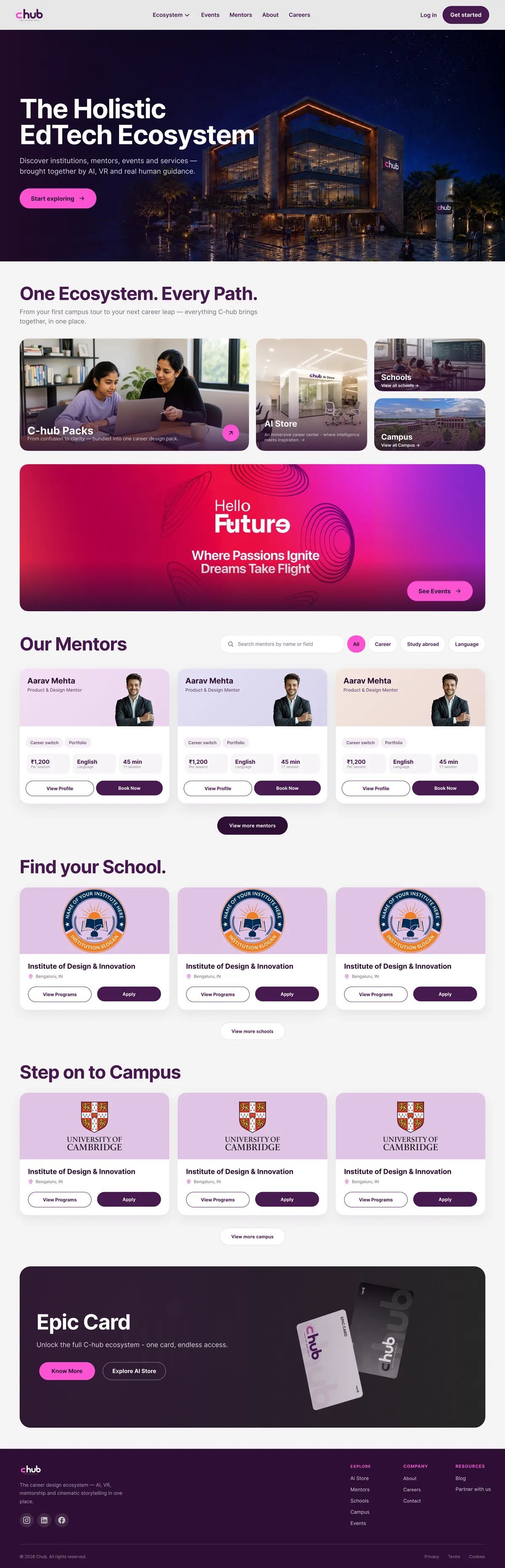
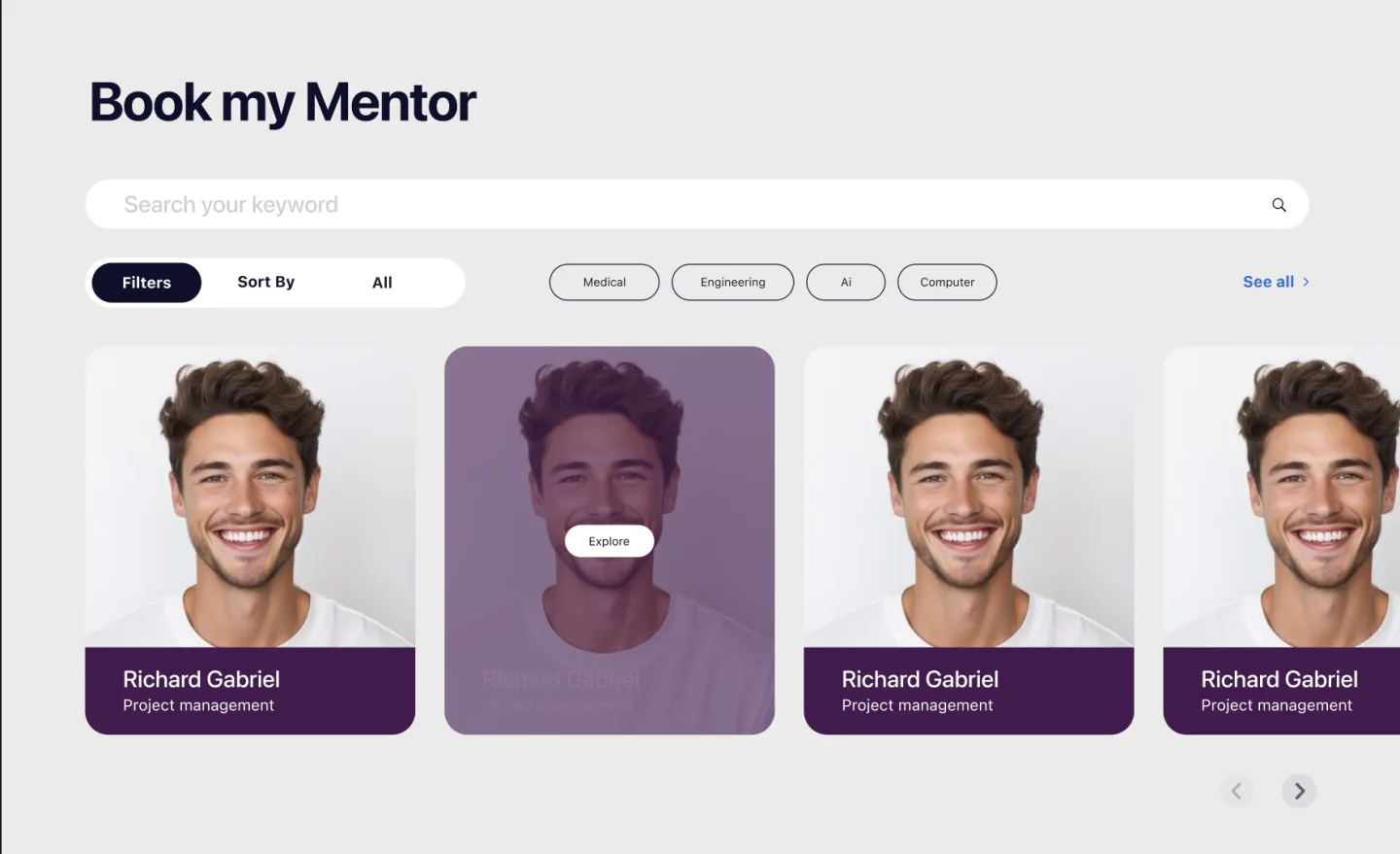
I redesigned the mentor section as well because previously, the section only showed the image, name, and title of the mentor. The button to know more was also only visible when hovered. The section was a moving carousel, and it was moving very fast, which made it hard to click the button.
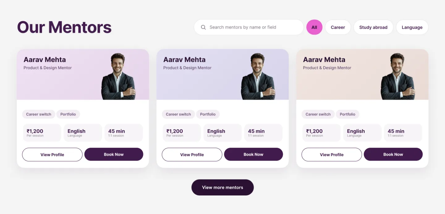
So I redesigned the mentor section to show more details about the mentor at first look: name, title, profile picture, expertise, payment per session, language, and clear CTAs to book the mentor and view their profile.
I was inspired by oppam.me while designing this section.
Previously, the design was not responsive, so I delivered a responsive design for both mobile and desktop.
Also, the entire color theme of the website was different from the brand theme, so I redesigned every page to match the brand theme.